We recently had the chance to surf the web and gawk at the type of sites out there. To tell you the truth, it reminded the team of the olden days – not necessarily the days of annoying, ugly websites, or slews of 90’s angelfire sites like the Vampire Cats Club, but close. There were a lot of reminders to be had and we thought we’d pass a few on to you (because we’re nice like that).
#1: Remember the Navigationally Challenged Visitor
These tips aren’t in any particular order, but if they were, we’d put this one at the top anyway. Why?
Even if you only had 100 visitors a month to your site, we could almost guarantee that at least half of them are navigationally challenged. In other words, they aren’t going to automagically know which buttons to push to get where they want to be. You, with intimate knowledge of your site’s architecture, must help visitors navigate the slippery slopes of site surfing.
You do this with two little things called consistency and guidance.
Consistency – When they come in from a search result, social media link or even an ad on another site, something has to let them know they’ve reached the right page. Where’s the connection? Is there one? Or have you done what many do and half-hazardly placed links everywhere on the off chance that the visitor might click on one of them?
Guidance – The whole point of having a navigation in the first place is to help your visitors get around your site and find the most important places. Are they going to do that if the link text is confusing (i.e. not straightforward) or buried under other things? You have to help them get where they want to go.
What if they don’t know where they want to go? Ah…. Again, that’s why you give them the navigation. A benefit of a clear navigation is that it provides you with a way to promote available information and products.
So… don’t expect your visitors to be able to find their way around. Many won’t. Test, test and test again!
#2: Remember Your Content When You Design

Your content and your design go hand-in-hand. The prettiest design ever will not make up for your content’s lack of interesting information, but an ugly design can lower your content’s ability to inform. How?
Blinded by the light – Bright pink sites may look pretty to some, but they can be hell on the eyes for others. Then again, this may not be any better. FYI, burning the retinas of your visitors is not a good way to be enduring.
Distraction, distraction, distraction – Have you ever visited a site, started looking around, and realized an hour later that… well, it’s an hour later? That site was sticky. Surfing a blog for an hour is great; surfing a product site without buying for an hour probably isn’t. The likelihood of you buying something after that hour is pretty slim.
#3: Remember Visitor Choice
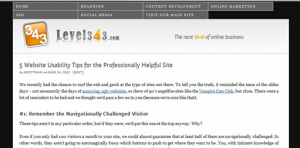
You’re viewing our current theme now, but if you click here, you’ll see the simplistic version. Clicking the “current theme” link will bring you back to the original version. It may have some kinks, so bear with us (for any browsers that may currently not be able to see it,the screenshot is above).
You can learn more about alternative style sheets and how to create this affect at A List Apart.
Choice can also come by offering RSS feeds to separate areas of your site. For example, if you’re only interested in branding, you can use the feed from our branding category to get the information to your inbox. You can set your feed reader to pick up each category individually, or the whole site all at once.
#4: Clean Up Your Search
Here’s a question. When you put that search box on your site, did you test it? If you’re asking, “what search box,” you need to get one quick. Putting a search feature on your site allows visitors to find what they’re looking for faster and easier. It does need to be clearly labeled, however, and wide enough that the visitor can quickly scan what they typed before searching. Finally, make sure you’ve tested your search feature, and that the results are reliable.
Finally, Remember Your Business
Level343 doesn’t currently offer feeds separately to the public because we don’t have regular postings in each category. For those that signed up for branding, for instance, you might get anywhere from two to eight a month, depending on how often we touch on that topic. So, keep those things in mind before you just willy-nilly implement things. It does depend on your site, and your business needs.
The key is to look at your business and your market. Everything you do online has to 1) positively reflect your business and 2) be helpful to your market. The same goes for your website. Anytime you consider making a change (and even with the website you currently have), ask yourself, “Does this positively reflect my business?” and “Is this helpful to my market?”










4 Responses
Going to forward this article to a friend of mine who actually has a blog that is entirely pink! She really needs to read this. Thanks for these great website usability tips.
I never realize this “Clean Up Your Search” I just placed a search box without trying thinking that it will work since the code was from google and it will definitely bring some earnings for me.
Guys, now I know you mean business when you are talking about how a website should look like. I really like your idea, but for me the real interesting part was that walk down the memory lane on how the websites used to be built in the late ’90s!
It sounds quite interesting what you wrote about feeds, very helpful. I agree with you: business and market.
Congratulations for the post.