Landing pages are basically one-page forms that are designed to capture the recipient’s attention and tell them about a product or service. They can act as stand-alone order forms, the second step in an email marketing campaign, or a teaser to get more eyes on your web pages.
Your landing page is the first phase of website optimization. A page that’s informative, well-constructed, and engaging draws traffic and introduces your brand or a new product to your audience.
They work by:
In order to be effective, your landing page should contain certain key elements and a story that connects with your audience. Ready to construct a great landing page that transforms casual viewers into customers?
Although many webpreneurs use landing pages as a stand-alone sales device, technically any page on your website that contains an order, subscription, or information form and no links to other pages could be considered a landing page.
Depending on the scope of your business, number of products or services, and your audience segments, you should have at least one new landing page for each fresh marketing campaign or offer. The design can vary from page to page, but each should be visually appealing, concise, and informative.
On average, you have 2.7 Seconds to grab someone’s attention and convert that lead. No pressure.
Here’s how it’s done.
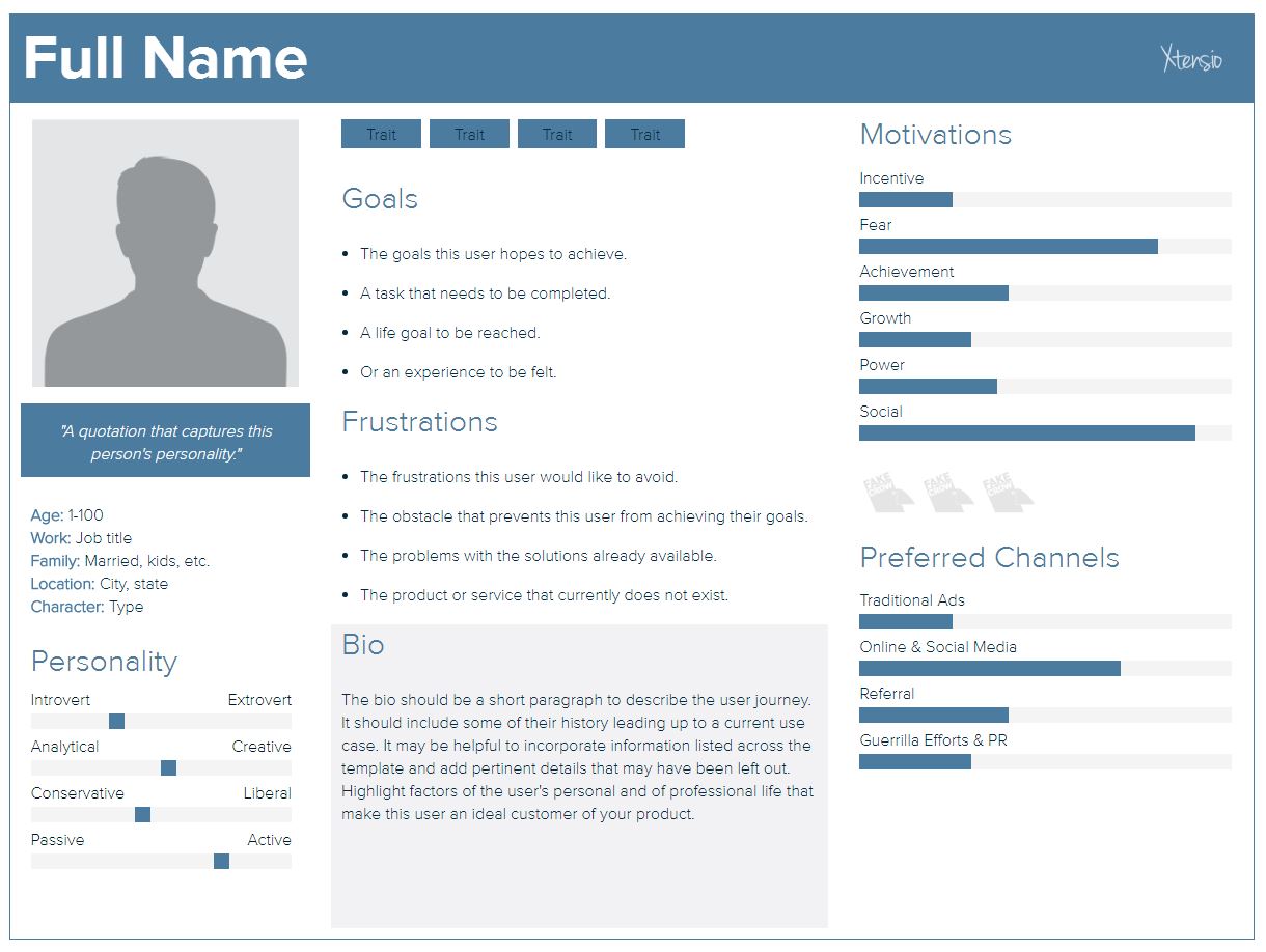
You can reach different audience segments or capture leads at various stages of the buyer's journey by knowing your prospects on a granular level. This will allow you to tailor your approach by specific demographics and improve your chances of nudging leads to the next stage.
Create a separate persona for each audience segment and create content that speaks to them in each version.
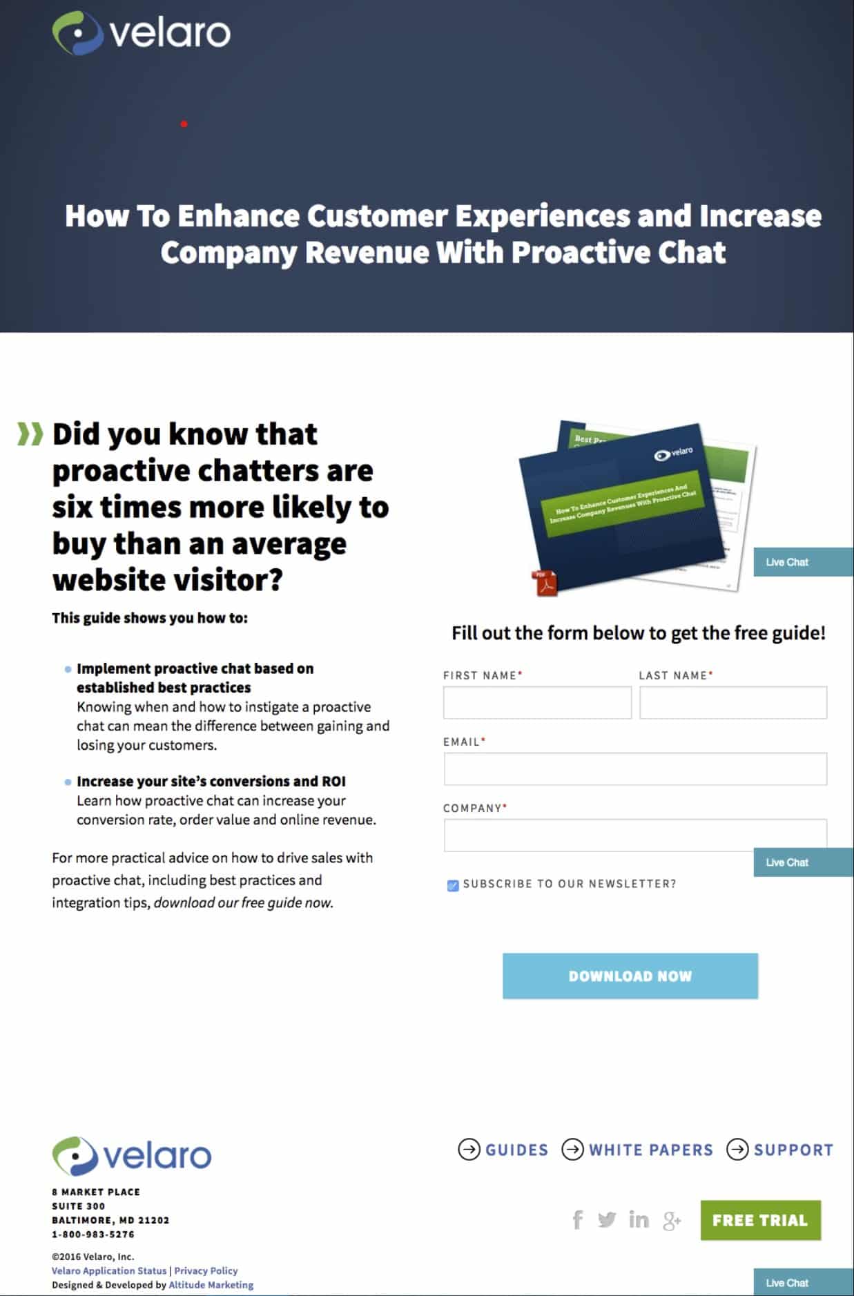
Whether it's a discount, a free gift with purchase, or some other prize, give your visitors an extra incentive to try your product or service. This should be mentioned once at the top of the page, once within the body of the text, and once at the end.
This offer from Velaro gives prospects a free trial and a free how-to guide.
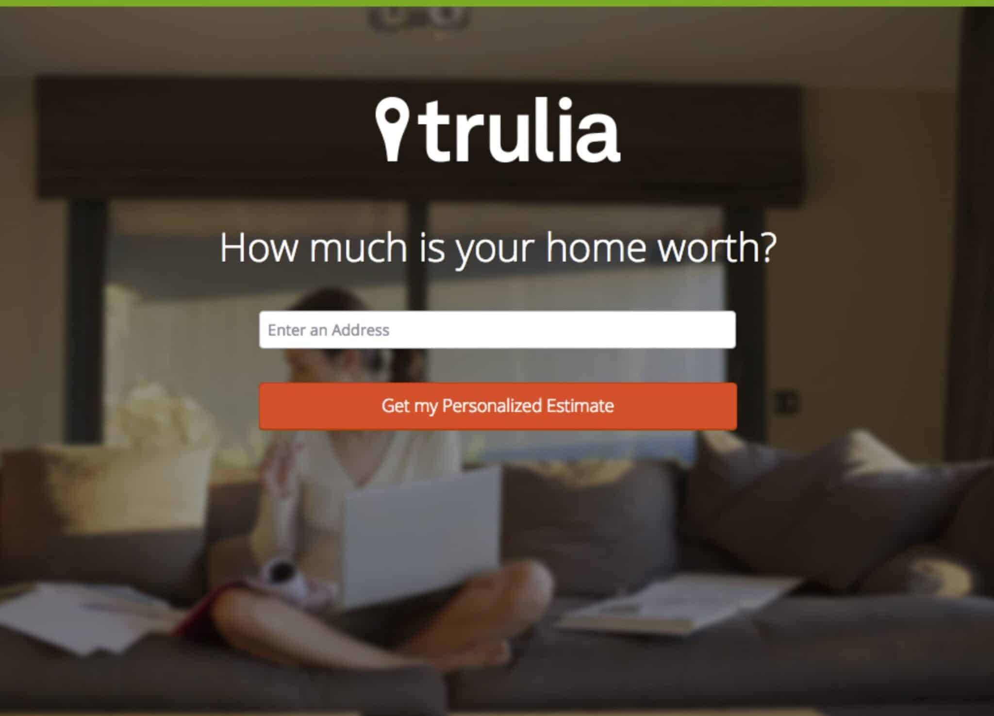
As mentioned before, you have less than 10 seconds to grab their attention and keep it. The best way to make a memorable first impression is with an eye-catching headline that makes the viewer want to read or investigate further. Your headline should contain a long-tail key phrase or keyword from your category, and the CTA should provide them with a clear course of action using as few words as possible.
Even if you aren't thinking about selling your home, this landing page from Trulia would at least make you curious about its value.
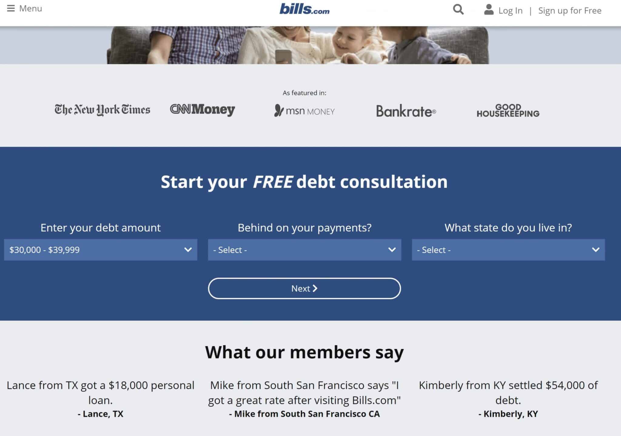
Trust is essential for branding and customer loyalty. Place trust signals like testimonials, certifications, or badges from verification companies at strategic locations on your page. Social proof also promotes trust so make sure that your page contains social media icons with the number of shares and likes visible.
This sample page from Bills.com shows their authority (As featured in) as well as their satisfied customer testimonials. Those trust signals surround the call to action.
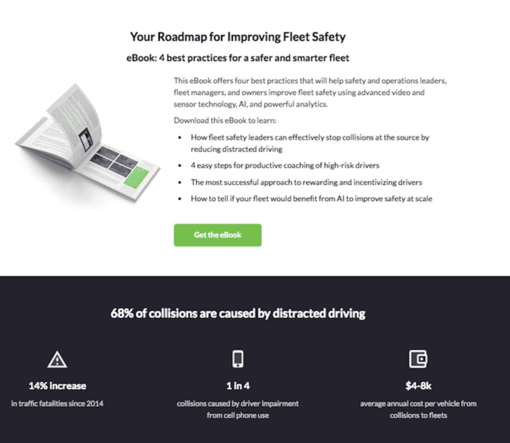
Don't string your visitors along with a story that takes forever to get to the point. Much as with a headline, you have to grab your audience within the first two sentences by introducing the product and benefits immediately. All the text that follows should build upon the pain/point benefit in a concise and logical progression.
This landing page from Nauto illustrates this perfectly.
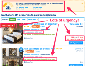
One of the biggest motivators when it comes to sales is Fear of Missing Out (FOMO). Make your offer available for a limited time, and add a few mentions of deadlines for action in the text and in the form of text bubbles stating that the item or offer is for a limited time or low on stock. CTA buttons should also lend a sense of urgency by labeling them with action words like "Buy Now".
In this sample page from a booking site, visitors are compelled to act fast by highlighting availability.
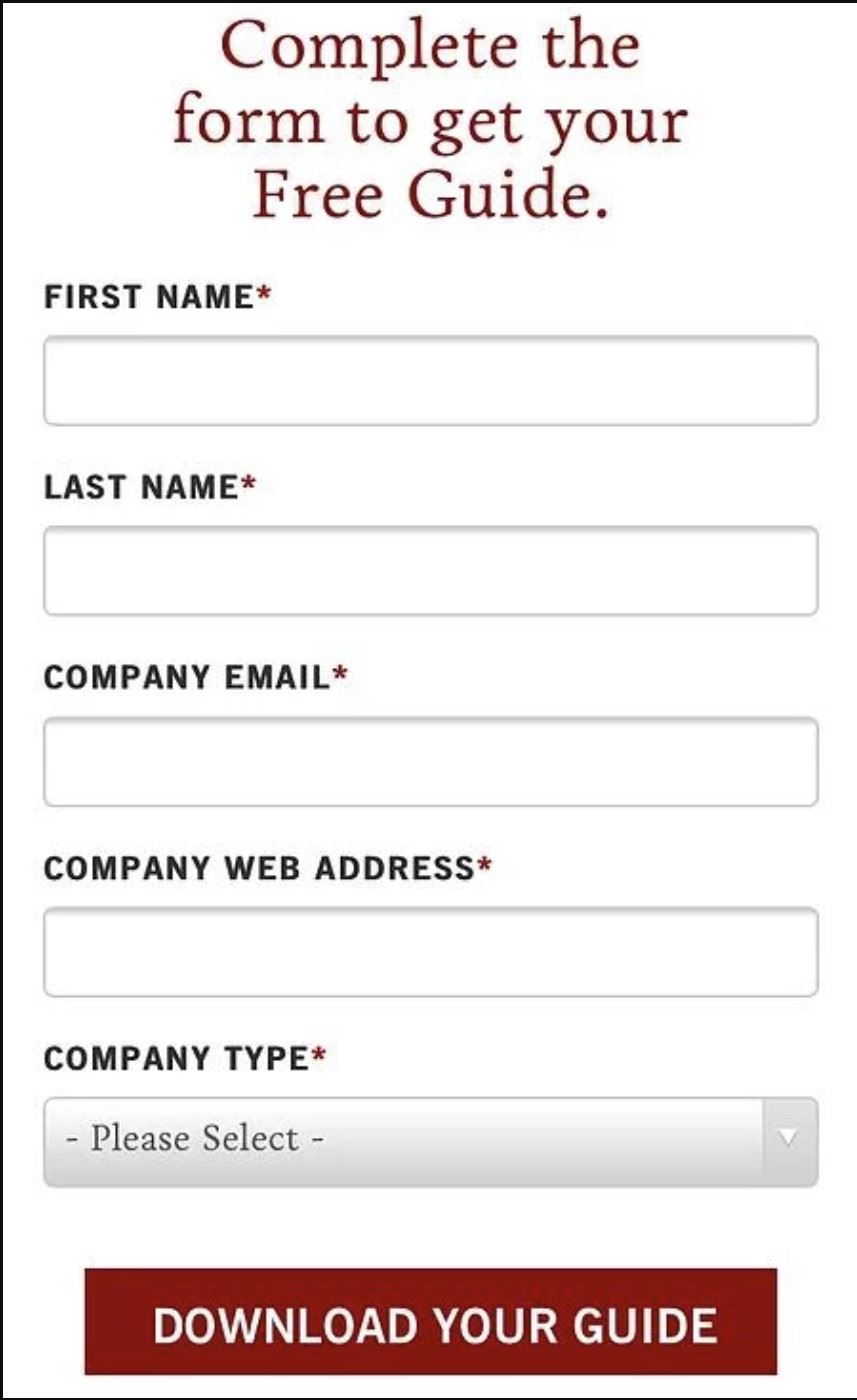
The majority of your audience will be interacting with your business via mobile device. You want to make sure that your page looks and performs the same regardless of device or screen size. You can ensure this by designing for mobile first, which is how Google indexes pages now by default.

The right image or video clip adds value to your proposition while providing the viewer with a visual demonstration of the benefits or use of your product. You can either use a background image for subtlety or a crisp, relevant header. Include a video that shows your product in action or an ideal buyer persona using your product.
This still from an adventure travel website demonstrates the possibilities in a manner that’s very memorable.
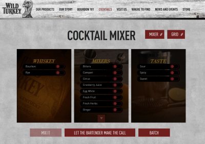
This is an optional ingredient, but adding opportunities for interaction will increase the amount of time spent on your page and up the odds of converting the lead. In turn, you will improve your SEO by providing a quality UX and engagement in ways that Google will reward with higher SERPs.
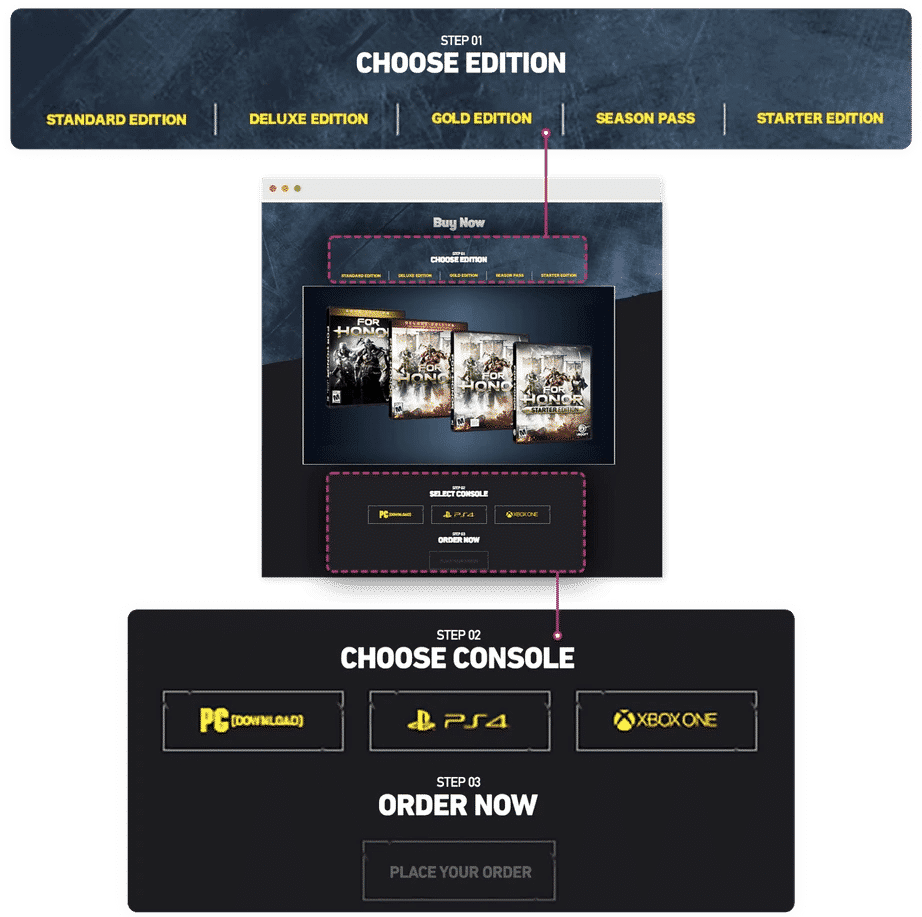
One good example is this landing page for Wild Turkey, which allows visitors to pick their poison and get more tailored results.
Last, but not least, you need to test a few versions of your landing page for effectiveness. In order for an A/B test to provide meaningful results, you should pick a fairly large segment of your audience that's composed of a similar demographic for each audience segment and conduct the test for at least a month.
Experiment with different headlines, fonts, images, and other elements to see which give you the best response Even something as simple as CTA button size and placement.
Your landing page is often the first contact you’ll have with a lead. Make sure it isn’t the last. Landing pages tell prospects who you are, what you’re offering, why they need it, and how to get it. When done right, you’ll increase conversions and improve brand awareness significantly.
This website uses tracking cookies to help us understand how you use the site and improve upon your experience. We do not share any information collected – either personal or anonymous – with any other parties, with the exception of the reporting programs we use in conjunction with those cookies. By continuing to use this site, you agree to the use of these cookies. If you do not agree, please close the site.