Web design can be a pretty complicated process, especially for business owners with limited experience in the field. A design that works has to reflect the values of the organization, share appropriate information, and make sense—aesthetically and practically—to the user. Simply put, you want a website filled with quality content that can be easily navigated and looks good.
Think about how you perceive a website for the first time. When you click from a search result to the site, your first impression comes from…what? Your first impression is a visual one. The same is true for your visitors.
We infuse meaning into colors, shapes, and the placement of elements. Colors—or lack thereof—reach out to you and give you an idea of what to expect from that particular site. Your eyes scan over images, headings, logos, navigation, colors; your brain processes this information in milliseconds. You may not realize it, but in the space of those few seconds, your brain has weighed, measured, and pronounced judgment on the site. It’s really not something you can stop from doing.
So…what impression does your design give your visitors? Is it professional? Does it truly reflect your values? Is what you offer clearly visible and your information easy to find?
Is your website design giving a good impression?
You may think you have a great website design; it makes you feel good. It swells your heart with pride. Is what you envisioned doing the job? How do you find out? Fortunately, there are several tools to help you answer this question. We’ve listed some of them below, but this list is by no means the end all and be all of design testing tools.
Browser size. You know what your site looks like to you; do you know what it looks like to your visitors? One of the many things to take into consideration is the size of the browsers your visitors are using. Websites can look completely different in different browser sizes. View Like Us and Google Browser Labswill show you how much of your site can be seen.
What sizes do my visitors use? Check your analytics. In Google Analytics, you can do this by clicking Visitors>Screen Resolutions. Once you know your visitors’ most commonly used browser size, you can optimize your website for that size. At this point of the game you may as well update your site to be responsive.

Contrasting Colors. Color choice is incredibly important, especially when deciding font colors vs. the site background. Just because you think light blue looks good on dark blue doesn’t mean your visitors will. As well, you need to remember that some people are color blind or may have other visual issues that affect their ability to read your site (like macular degeneration that makes it difficult to read light letters on a dark background). Your design colors need to meet accessibility guidelines for this. Check My Colours can help you find some potential issues in terms of color contrast, while VisCheck (a work in progress) can give you an idea of what your site would look like to those with color blindness.
Is your color choice negatively affecting your visitors? The only way to know is to ask and/or test. Find the Perfect Colors for Your Website Vandelay Design has a large list of color tools you can use to create other palettes for your site (or keep your main color and change the supporting colors). You can then offer visitors different options by:

- Using a website optimizer program for A/B/C/D testing.
- Uploading to a place like Usabilla, which allows individuals to comment on your site design.
- Uploading your color schemes as images and letting visitors vote on them.
Browser compatibility. Some people will tell you, “Technology is growing to the point that a site will look the same across all browsers with no problem. Worrying about browser compatibility is a waste of time now.” It’s B.S. The only way browser compatibility is no longer a concern is if you don’t care what the site looks like on a different browser.
Internet Explorer is famous for its inability to play well with others. However, sometimes it’s Firefox that acts up. Or Opera. Or Safari. To ensure a seamless experience across all modern browsers, it’s always best to check your site against browsers other than the one you’re using. Adobe Browser Labs, Browser Shots, and others allow you to see your site as your visitors might see it.
What browsers are my visitors using? Again, you can check this through your analytics program. With Google Analytics, click Visitors>Browsers. Pay attention to the most commonly used browsers and optimize your site for them. If you have a high number of mobile visits, you might consider crafting a mobile version of your site to support this.
Is Your Website Usable?
Usability is extremely important. Not only do your visitors need to understand what your site is about, but the site also needs to be intuitive—that is, easy to use. You can’t judge this yourself; you know how the pages are set up and what you expect people to do. You have to learn how others will view—and use—your website.
When a site is designed, the creator has to understand the difference between creativity and stupidity. One of our favorite examples of usability mistakes happens when the shopping car icon is placed in a spot that makes no sense to the user. If you put a shopping cart down in the left hand corner, it’s almost a guarantee that your visitors will be frustrated by the inability to find it without searching. A frustrated user will leave your site completely.
Is your website frustrating to use?
How do you find out if you’re having this problem? One of the things we really like about Google Analytics is the ability to find out where users go after landing on a page. For a number of sites we’ve come across, users landed on the home page—and then clicked on an image or link that, essentially, just reloaded the home page.
In Google Analytics, you can view user paths by clicking Content>Top Content>Entrance Sources and choosing the page you want to see. You’ll see the previous and post pages for the one you’re looking at. If the information you retrieve indicates user confusion (such as “started at home page, then viewed home page, and ended up on the home page”), you know you’re in trouble. If you see a lot of back and forth between pages (services>home>services>home), your visitors aren’t finding what they’re looking for. Then it’s time to rethink your page.
You can’t just jump in and start changing things, however. You have to have insight first. 10 Usability Testing Tools for Startups gives you several options for usability testing. Other options include:
- Loop 11
- SMT – Simple Mouse Tracking is a simple tool that lets you track your visitors’ mouse movements.
- Click Density
- NavFlow
- IntuitionHQ

More Tools of the Trade
Google offers several tools to help you understand your audience. Google Analytics is a free tool that will show you where your visitors are coming from and the links they click. It’s rather simple to use and adequate for most users. Another great feedback tool from Google is Talk Chatback. This is a live chat device that lets you hear directly from your visitors. Your customer service staff can ask questions and get feedback on your site straight from the source. (This also gives you an opportunity to convert the visit to a sale!) You may also want to consider adding a Google internal search option to your site. This allows you the chance to track what your visitors are searching for and adjust your content accordingly.
Customer surveys are another excellent tool for getting feedback directly from your consumers. You can ask your visitors questions about their experiences on your site and find out what kind of content will be most useful for them. KISSInsights and Survey Monkey are free platforms for creating surveys on your site.
Web designers may create beautiful websites, but they have to understand your audience before that pretty site will do any good. You can do your part by using these tools to take an honest look at your site and how it is being perceived by the most important people—the end users.


9 Responses
Great Post there visitor is the only best supporter for blogger income and without that no earning source for blogger.And that post give real chance and tips that how to monitor visitors.
And that’s the best for blogging point of views!!
Cheers Happy Holiday Season!!
The first impression is so important! A site only has about 8 seconds to make a great first impression, otherwise the visitor will leave – it’s that quick! Along with the first impression from how the site looks and operates, you want to make sure your branding is consistent throughout the site. Your logo should be on each page and the colors used should be consistent with your brand.
The key is to give your designer/developer as much information you can about your business, your website goals, and what you are looking to achieve. It has to be a close relationship between you and the design and development team, so that when you get to the finished product (your live website) its exactly how you want it, and most importantly its done in a way that will work for your business.
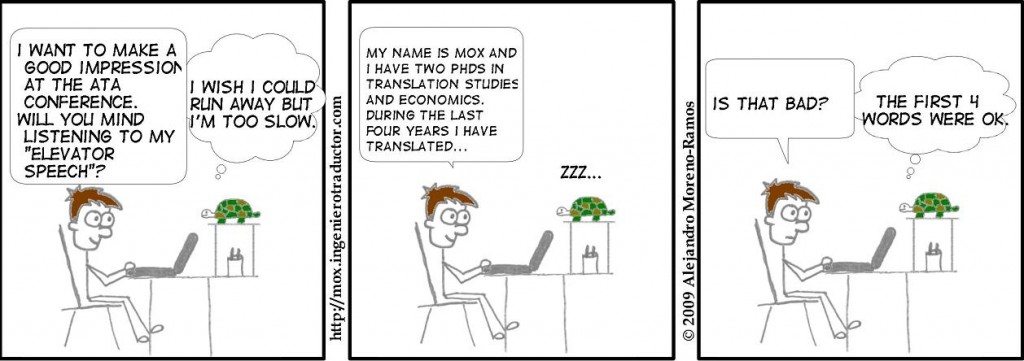
Loved the comic, it summarizes how important good impression is. I also like your views on looking something from a different angle. This is an excellent post.
Thank you – it’s always nice to hear positive responses from our readers!
Thank you for these tips! I am actually thinking of hiring a professional to design my blog. I’m planning to put it up for my business. I believe people fancy blogs which are visually pleasant and more animated.
You’re welcome. 🙂
First thing a visitor will notice on your site are the pictures. While it takes minutes to read a description it only take seconds to understand a picture.
That is why is important to try and describe what your website or blog post is about with some pictures and a good title. This won’t frustrate your visitors and will make them browse further if they like the topic.
Unfortunately some webmasters are not aware of the importance of simple and functional design and create complex and heavy loading pages with bad color choices. I don’t know about you but when I find a website full of animations and no info about what the actual page is I tend to bounce.
Another fantastic post! All of these things are elements that we all need to consider as fervently as possible when creating a website. Personally, I have to admit I’d not thought of colour blindness or ‘macular degeneration’, but they too are key to a site’s success, regardless of how small an audience these conditions cover.
What really strikes me is the range of topics we need to think about as web designers to ensure that a client’s site, or indeed a site of our own, is viewed and read as easily and seamlessly as possible. On too many occasions, the design has been beautiful, yes, but the overall construction is totally lacking in thought and leads to a virtually pointless website. I’ll certainly be looking to take some of the points mentioned here on board, and I certainly hope others will too.