Happy New Year! To kick things off right, I want to talk about the foundation of your site. Site Structure: Don’t Neglect It…Please!! The importance of proper site structure and organisation The structure and organisation of your site is so important and it doesn’t get as much attention as things like copywriting and link building (don’t get me wrong, those are crucial, I just think we need to look at the structure too, we don’t want it feeling left out!)
If you haven’t recently evaluated the structure of your site, now is a good time to do that. If you are about to embark on a redesign, definitely plan the structure and organisation of content before you begin.
I am not going to go into much detail on things like clean code and java script etc. For now I want to talk about navigation and linking. Most people just throw it all together and let it take shape as things go along. I think that is a mistake and it’s well worth some thought and planning time.
Never forget the goal of the search engines: they want the site that is most relevant to the search query to come up on top. So your goal is to prove to the engines that your site is relevant to the theme that matches the query (if you focus on developing strong themes and not just one keyword phrase, you’ll get broader reach).
One of the best ways to show the search engines the “theme” or “topic” of your site is by being clear to Google. You can begin by grouping your content pages together by topic/category and build the content out in sub-directories. Your navigation should follow in the same footsteps. So you would link to the core category pages in your main nav and then have a sub-navigation that is for all relevant/connected pages (you may have to supplement with some internal linking – more on that in a minute).
Let’s talk for a minute about establishing your themes. To determine what your themes are, ask yourself the following questions:
What themes are currently ranking well for my site? It’s always good to start with what is working and see how you can expand it.
What subject themes are relevant to my site? Think in broader terms here.
How would a user search for my content (main search queries)? This helps ensure you are in the same mindset as your visitors so the site makes sense to them.
Next you want to think about how to organize the links. You want to avoid making the engines and site visitors to go too deep to find content. In simpler terms, the depth of your site is calculated by how many clicks are needed to reach any individual page from your homepage.
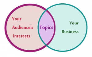
Less clicks is good for site visitors – it’s easier and quicker for them to get to what they want. It’s also good for the engines.
A challenge for larger sites is controlling the depth. You don’t want a large, cumbersome navigation with hundreds of links right on the homepage.
Using sub-navigation (drop-down or flyout nav) helps organize content and helps you get more links in there.
But you can also take advantage of an internal linking structure. There are a lot of different ways you can structure it: you could have 3 main category pages and when you click on each of those, you go to a “landing page” for the category that has further navigation for that “section” of the site. Or you can link within body content to other relevant pages.
If you are going to do internal linking, be sure to use keyword phrases as the anchor text (clickable part of the link) to get an extra SEO boost. (Now don’t go stuffing your text with keyword rich links, as with all SEO strategies use it naturally.)
TIP: Whenever you add new content to your site, think about what category it belongs in and set it up there but then also think for a minute about what other relevant pages you could link to from that page to help guide readers through your site. Again, it’s creating an interconnection of relevant pages.
I find it helpful to create a little chart in the planning phase, that way it can be used (by you or your web developer) in building out the site. If you keep it updated as you add pages, you will ensure that your site is always well organized.
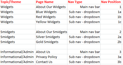
Here is a sample chart:
Once you have the content structure organized, you want to think about the technical implementation.
For starters, make sure you avoid using code that the engines can’t follow. Avoid creating your navigation in Flash or all in java script. If you have to use images, make sure you use ALT tags. Whenever possible, I like a nice clean, text based navigation. You can use CSS to “pretty it up”.
There is some debate about whether you should use absolute or relative links. I’ve seen compelling arguments on both sides, so my best advice here is just be consistent.
This may not be the most exciting topic, but it’s important and definitely worth your time and attention.








13 Responses
I get so much hassle trying to find good blogs, it seems most people runs them to earn some extra cash
I have added you in my reading bookmarks, keep up the interesting work!
Thanks Dora. We don’t monetize our blog, we get many offers for advertisement and links but it’s not worth it to us.
Exactly, since organization of the staff is critical. By organizing them you can obtain below advantages.
1. Gender balance in the company
2. Find key performers
3. yearly review of the staffing
these things can help human resource managers a lot!
Thanks, Jennifer. This is quite good. It is always easy to forget about site structure. In my opinion, this is where solid on-page SEO starts. The foundation, almost of an effective search engine strategy (if one could call it that). Moz has an epic post about information architecture, and how to “site plan” for SEO. A lot of the points there corroborate yours. I’m looking at this as a comparison, I’m just saying that I agree with your post. A lot.
Many times I see clients with an unusual/confused site architecture. I don’t expect that they would be experts in site planning, but just starting out with a planning sheet, kind of like the sample chart you have, is great. Many clients, though, think they don’t have the time for all that. Then they wonder why their content is lost in the search engines. In any case, I’m bookmarking this post, just as I did the one from Moz. Great work.
With regards to SEO, the very best thing that can be done is to make your internet site structure appeal to folks. If a person can easily logically navigate a streamlined structure while using the navigation, then a search engine could have no problem doing so from the URLs and internal links on the webpage.
Jennifer – I like it — and I think it is an exciting topic. One of my best “Schools” to understand navigation strategies is to look at major B2B and B2C websites (the 500 to 3000 page kind) and compare the approaches they take. To flatten their navigation, sites this big may need to fit 100 or more links on the home page. So, besides the sub-navigation (and both major and minor horizontal nav bars) they may need sidebar menus.
Since I can’t see their analytics, I focus on your 3rd question — the user. I try to look at a site like Grainger (great industrial B2B) and compare it with a site like Kohls — through the eyes of their major customers, just to see if those sites meet “my” unique navigation needs.
Look at the eye-tracking “hot-spots”, the “F” shape. Kohls puts their sales on the left and their sidebar menu on the right — because they know that the sales are what get me into the store. Grainger puts the sidebar menu (an accordion with “products” and “brands” on the left) because they know that I’m an engineer or a building manager who doesn’t have time to browse. I also always look at their robots.txt to see what they disallow, and whether they have an xml sitemap. (How to deal with an XML sitemap on a 1000 page site is a post by itself.)
At any rate, this is a great topic with lots of winding alleyways to explore, easily big enough for a book 🙂
I appreciate the in-depth comment. I agree, a topic big enough for a book. Want to co-author it with me? LOL
What a courageous suggestion – especially considering how long-winded my comment was LOLOL
LOL I’m a brave girl! 🙂 Seriously though, I loved your comment and your humor is great!
I couldn’t agree with this post more. I’ve actually had a lot of success with some of my client sites by just changing the navigation structure, and seeing jumps in rank just in improving the crawlability and usability of the website.
Thanks for the feedback Ryan. It’s good to hear that, I preach this to clients all the time and people just don’t get how navigation impacts things. Keep up the good work.
User experience about your website matters most if you’re selling your products and services. If visitor is not happy with website experience then he hardly buy anything from your website.
Aasma,
Very true. Thanks for your participation in the discussion.