Although this article was written as far back as 10 years ago, the practice of good information architecture (IA) is still a much misunderstood endeavor. In various ways, at various times, we and our guest bloggers have written about information architecture time and again:
* “Make decision making simple” : 5 Essential UI Web Design Tips to Consider for your Website
* “Do you know how to properly categorize, taxonomize, and tag your various bits of content? If the answer is ‘not quite’, you are far from alone.” : Categories, Taxonomies, Tagging, Oh My!
* “Your product page has one objective: to convert curious eyes into paying customers.” : How to build and enhance your product pages
But the fact is that IA is more than just moving a few parts of your website, or putting content into categories. It’s much more involved, but it’s also worth much more as a practice, than it seems…
The Level343 Editors
What is Information Architecture, or IA, and why is it important? Is it just Artificial Intelligence (AI) misspelled? Who does it? Who should?
If these questions have been buzzing around in your head, getting in the way of daily thought, this article is just the thing for you. On the other hand, if you’re only interested in creating a user-friendly, converting, professional, etc. site, read on, oh grasshopper.
The Science of Information
IA isn’t a typo that was supposed to be AI. IA is an actual science. You can even go to college for it. I especially like the way Information Architecture for the World Wide Web describes it:
“The art and science of structuring and classifying web sites and intranets to help people find and manage information.”
Information Architecture for the World Wide Web
An intranet is an enclosed system of information; to put it simply, it’s a private area, accessed only by specific people, such as employees using a corporation’s intranet. Now, bear with me, because I’m about to share a wild idea…
Imagine your website as an enclosed system of information. You have your business, and you want to build your website as a personal business hub. For example, let’s say you sell tools. You have tools for home repair, car repair, boat repair; you know your website is the perfect place for any DIY fanatic.
How are you going to lay out the information on your website? What are you going to do to keep visitors there? What are you going to do to bring them back?
This is where information architecture comes in, and it all starts with creating a blueprint – a diagram of how you’ll build the site to make it easy for visitors to:
a) Find necessary information
b) Navigate easily to other, related areas of the site
c) Read, ask questions, buy tools
Creating Your Site Structure
Now, information architecture is more than just usability, but usability is part of it. You need to figure out the best way to lay out your site to make it more usable for visitors, easier for search engines to crawl and in a way that makes sense.
How are you going to place your important areas? Here are three examples on how menus can be placed:


Once you figure out how you’re going to lay your pages out, you then have to figure out how you’re going to lay your menu out…
Top Navigation Nightmares

Will you have a “home” link to the home page? If your visitor is on a page, will the link to the page still work or will it become a “non-link”? Will you have a contact link or just a phone number? Before creating your top navigation structure, you’ll need to answer these questions.
Second Tier Navigation
Often called “dropdowns”, there’s always a question whether second tier navigation is a good or bad thing. If you can create a nice, clean top navigation without making dropdowns, more power to you. However, if you have way too much information to share, some form of secondary menu is necessary. After all, a main navigation with 30 links just wouldn’t be reasonable, would it?
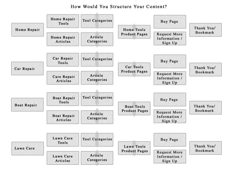
So… how would you lay out your information? Look at the image below, created using the example of a tool shop. (get a bigger view: Information Schema / Content Layout)

While this information layout is pretty basic and not researched or extremely thought out, it should give you some ideas of how to structure your layout. The main categories (1st left hand column) might be part of your main menu. The next column your second tier.
Anything after the second column, however, you may have several links. In this case, it may be best to create a secondary menu on the side, or a page for each menu section. Think hard about it. Try to develop a mockup of any way you can think of to lay this information out; it’s much easier to judge a visual representation than try to see it in your head.
Conclusion
The architecture of your site content shouldn’t be taken lightly. Not only can this help search engines provide more relevant results when you show up in the SERPs, but it can also make it much easier for users to understand and navigate the site. Remember, there’s no such thing as “intuitive navigation” – not really. However, the closer you can come to it, the more often your traffic will come back to gain information, look for products – and convert.


12 Responses
JRPittman – I haven’t heard of IA, or Information Architecture until now. But I’m kind of surprised this is my first time reading anything about this since everybody wants to lay out information on their website properly, keep visitors there, and bring them back, and from what I’ve read here that’s pretty much what IA is about.
Thanks for the tips on improving the architecture of my site I will make sure to implement them soon when I get a chance to. Happy New Year to you and your family.
Hi, John – One of the most frustrating things about Internet technology in general, and SEO specifically, is the many terms to describe a single thing. You’re in the industry for years and some new pup comes up talking about something you’ve never heard of, it can make you think you’ve missed something. However, when you dig down and find out what the term means, what you find is it’s just a new term to describe an old hat technique.
Would you be surprised to learn that IA is actually a college course? Yup, there’s an app for that. 😉 So people talk about usability, site structure and readability, but it’s all just another way to talk about IA.
Thanks for the comment, and glad we could give you some information to chew on!