Many of you may not know, but we put up a website usability survey on our site some time back in October. At the end of the survey, we left a place for open-ended comments where visitors can add their thoughts, tips, pointers, etc.
Of the responses we get, most of them are positive. “I like your site” or “concise writing and clear service offerings”. We get “easy to navigate” a lot. However, sometimes we get a response like, “Site is difficult to navigate. There is too much content making it a busy space.”
Here we have a case of conflicting commentary. Does the comment about the navigation being difficult negate the positive comments? Do we scramble to fix a potential problem?
No. Instead, we remember the first rule of any endeavor…
Let’s consider why you would want to please everyone. Think about it in terms of business. If everyone who came to your site wanted to order products or buy services, could you handle the load? On top of that, can they all afford your services and/or products?
You Can Please Your Target Market
To do so, you have to listen. Pay attention to what your target market likes. Get feedback:
- Add a survey to your site (we use 4QSurvey).
- Start a usability survey for your site design (we use Usabilla).
- Add polls to your blog about content, etc. (we use PollDaddy).
- Create different color themes (same layout) and let people vote on them (PollDaddy).
The Psychology of the Web
Psychologists will tell you each person needs an individual plan. If you and your brother have anger issues, your treatment will still not be the same – even if you’re using the same psychologist. Why? Because psychologists recognize that people are different.
Let’s translate that to the Web.
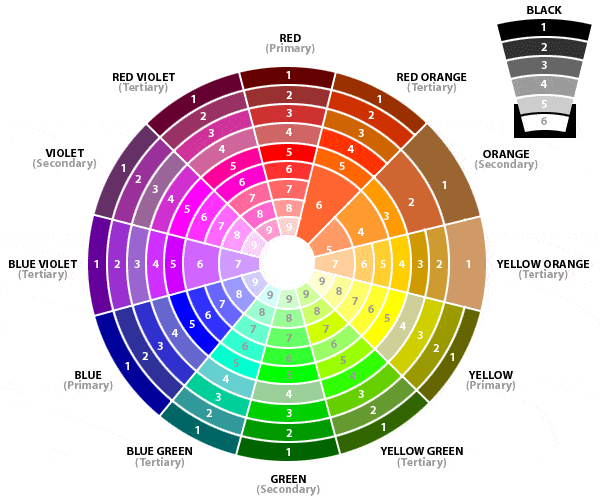
Color in Web Design
“One of the most fascinating elements web designers tend to overlook is the influence of color on their website visitors. While a color palette may look visually pleasing, is it psychologically pleasing?”
~ Andy Crofford, The Psychology of Color
The colors you use are just as important as the final site layout and content offerings. What do your chosen colors say about you?
The psychology of color is important in logo and site design because colors cause emotion. For example, red gives a sense of urgency and excitement; it’s used a lot in clearance sales. Many banks use blue because of the sense of trust the color gives.
“Color Language: Most colors have strong associations that everyone seems to share. This subtle “language of color” is an important consideration in color selection.”~ Color Meaning, DutchBoy.com

If your site isn’t converting, you may not be reaching your target market. On the other hand, you might be reaching, but not enticing. Try changing your color scheme using A/B testing (don’t just change it site wide, try a page or two, first).
Information Architecture
Information architecture is just a fancy name for content layout.
IA deals with things like how you lay out your navigation and categorize the information on your site. In other words, just about the most important things your site can have.
A website’s architecture is also one of the most missed parts of creating and tweaking a site design. To read: Information Architecture – Content Layout is Everything.
Usabilla is a good place to find out if your information architecture is a problem. With Usabilla and 4QSurvey, people can give you comments. The comments we’ve received from these two places helped us streamline our main site.
Wording and Delivery
Certain words cause emotional reactions. Buy vs. Act is a good example. Should you use Buy Now for your call to action or Act Now? Doesn’t the word “act” give you just a little bit more of a sense of urgency?
The best thing to do for your content is to hire a copywriting consultant. Usabilla can help, but remember words mean different things to different people. You can get a lot of conflicting advice (which is why we recommend the consultant).
Now, content, in this case, means your business site; this doesn’t include your blog. Have a copywriting consultant look over your current content and help you tighten it up for stronger conversions.
When you’re writing blogs, pay attention to how people react to each one. Sometimes, you’ll find a topic and tone that blend together well; you’ll know, because you get more reactions, more comments and more retweets. Sometimes, you’ll find a poor topic and poor tone; no reaction, no comments… and you might as well have dropped off the face of Twitterville.
If you really want to become a stronger online writer, read the work of Jakob Nielsen at Useit.com: Writing for the Web. Nielsen is a highly recognized usability expert; he’s done more studies and research on the topic than the Netherlands has done on marijuana. We don’t normally “highly recommend” another site, so you know this is a good one.
Conclusion
We mentioned “listen” once in this article, but don’t think it’s something small. Usabilla and 4QSurvey are great little tools, but the responses come slow (hundreds of people visit our main site in a month; we only have 28 responses on the 4QSurvey – just as an example). Therefore, you have find out what people are talking about; follow the links to sites they share and compare your site to others in your industry.
You’ll find out, as you read the information above and start paying attention, that website usability is paramount to strong conversions. If people don’t understand what they should do, they usually won’t do anything at all.
Have you found issues on your site with color, information layout or content? What did you do to solve the issue – or have you done anything? We always welcome your input.


12 Responses
I think everything about the blog reflects about quality content. I think design is still important nowadays.
Thanks Josephine, we are constantly improving our presence online.
Great round-up of some key #UX areas we should keep top-of-mind, and good suggestions of how to get the feedback this requires.
Two points:
1) Colour can also be culturally specific, so Chinese see red for luck, white for death, etc. Bear in mind who is your audience.
2) Remember too that while we should heed what people say they want, we don’t need to let it drive us; sometimes website visitors can be oh so fickle, so filter what they’re saying. If you disagree with a suggestion, don’t discount out of hand, rather check others thinking (i.e. use one or two trusted advisors too)
@Tim – Thanks for commenting, Tim, and for the compliment.
Flashy sites with loud colors seem to slowly becoming a thing of the past. I think this is partly due to “information” replacing “misinformation”. Let’s keep our fingers crossed that they disappear altogether!
@Barbara – Thank you for taking the time to comment, Barbara. It’s always nice to hear from our readers 🙂
I strongly believe that the usability of a website is very important in order to grab the attention of the visitors and win loyal readers. I don’t like browsing sites which are too flashy and use loud colors which strain the eyes. I think everything about the blog reflects about quality content.
It’s an excellent post, and well worth the read. I think design is still important nowadays. Jacob – thanks for posting your link. Thanks vey much for the post.
The usability of a website is very important in order to grab visitors attention, colors certainly play an important role in the mood and psychology of a visitor since colors cause emotions as you said and as any marketer knows people buy cause of emotions not cause of logic, thanks for sharing, really valuable information…
Great post – I actually wrote a bit about the UX of colour – you might be interested in having a quick look: http://spyrestudios.com/the-user-experience-and-psychology-of-colour/
Also, as far as tools go, may I also suggest IntuitionHQ (where I work) – similar to Usabilla, but only $9 a test for unlimited respondents, questions, screenshots and everything else.
Thanks vey much for the post.
Jacob – thanks for posting your link. It’s an excellent post, and well worth the read. You really went in to depth there! And definitely, I’ll have to check out your suggestion of IntuitionHQ. Sounds interesting!
I am constantly changing my website to give better user experience. I think usability is very important in web design. Great article, thanks for sharing 🙂
I think design is still important nowadays. Many people like sites with awesome designs. I one of them.
I’ve had similar experience with surveys on my site – what does it say about our site usability, if no one chooses to actually respond to our call to action? 🙂
I LOVE the color psychology – such a fascinating area…
Thanks for the tips!
Ana