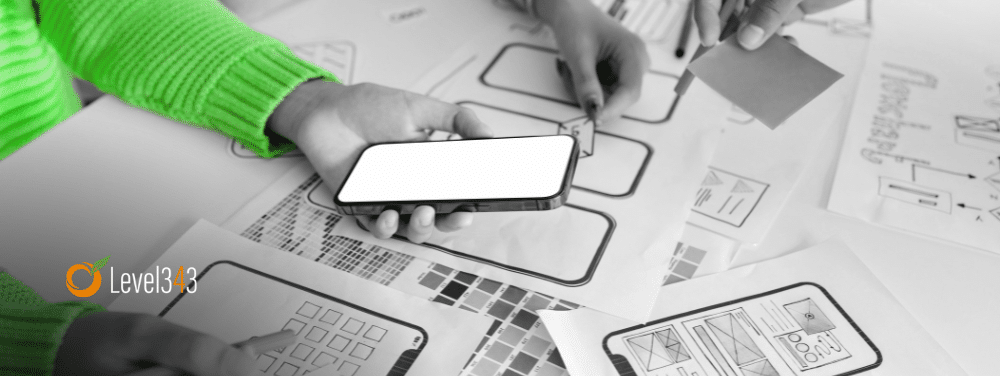
A website is more than just a few digital pages on your device that display content and link together. It’s an interactive interface that helps users to explore, connect and communicate. When a user makes an interaction with a website, they’re being provided with an experience and as a web designer you need to make sure this experience is immaculate as possible for them.
User experience depends on many elements of the user interface including the layout and functionality of the website. Taking into consideration these UI websign tips will help you to think of the bigger picture when it comes to your UI web design.
1. Get a good understanding of your users
The most important thing to consider is making sure that you understand your users and what they want from the experience that you provide. This means looking into your data and becoming familiar with their user journey to see what’s stopping them from achieving their goal.
On top of that, it also means speaking to your users directly and asking them what it is that they want from your services and products. What is it that they want? What do they want to achieve? Is there something that’s stopping them? Speaking to your users should never stop, as their needs are continuing to change and in gaining this feedback you can improve the experience for them.
2. Provide expectations
The most frustrating aspect for users when it comes to interacting with a website is not knowing what the consequences will be of that action. Clicking certain calls to actions can lead to spending money, directing your user to another website or erasing something they didn’t mean to. This can lead to anxiety for your users, which is something that you definitely don’t want.
So, ensure it’s clear to your users what will be the result of their actions. Make this clear through your web design by doing the following:
- Use common language in the desired button
- Use colour codes for the action (for example – choosing green for “yes” or “go” and red for “no” or “stop”
- Making it clear what the relevant button is for the desired action
- Using caution pop ups to advise what the result will be of the action
- Using clear language
- Providing directional information
3. Make decision making simple
It can be overwhelming for users when they’re bombarded with several advertisements and pop ups about subscribing to newsletters or applying for a scheme, even when we’ve not had a chance to find out more about it.
This can be frustrating for the user but it can also hinder your own performance in regards to UI design. By presenting your user with so many UI options, it makes it far more difficult for them to make a decision. This can be considered in many aspects of UI design including:
- Layout template
- Pricing pages
- Navigation menus
- Content feeds
The bottom line is that the simpler we create the design of the user interface, it helps to make up the minds of the user much easier. This is why calls to actions should be kept minimal for aspects such as landing pages or non-newsletter emails.
4. Keep your interface easy to learn
It’s suggested that people can only hold around 5-9 pieces of information at any one time in the short term memory. Making your user interface easy to learn can help users to remember it in the short term. So, wherever possible try to limit the number of things that your user needs to do in order to use your interface effectively.
5. Act quickly to provide feedback
Computers don’t act as quickly as the effects we see in the real world. Whenever we see something scary, we scream. A cat will purr if we stroke it. However, with digital interfaces we often don’t get a response, which means we have to predict what to do next rather than being provided with instructions.
So, when an action, provide that feedback to the user so that they know it’s been completed or what they wanted has happened. In doing so, your interface is being responsive and alerting your user of what they need to do without taking the wrong step.
Use these essential UI web design tips
Now that you’re aware of the steps to make effective web design, be sure to make these considerations when you’re next creating your interface. Whether you’re your own web design or work with a design agency that supports your creations, these tips can be extremely useful in ensuring your users’ experience is one that is enjoyable.
Author Bio
Jamie Costello is a marketing and design freelance writer based in the UK. He uses his previous education and experience of working alongside a design agency in his hometown to help collate his articles. When he’s not writing, he likes to read and play sports.


