Yes. The holiday season is upon us, and the fierce competition for consumer dollars has reached its frenzied annual peak. So now is the time to make sure your e-commerce website has that “competitive edge”.
Black Friday and Cyber Monday may have come and gone, but it’s not too late to optimize your site before Christmas day!
It is well-documented that the last week leading up to Christmas can be the most profitable with those 11th-hour purchases…especially if you can offer free shipping and guarantee delivery for a Christmas un-wrapping.
So if you’re wringing your hands about competing with the big boys and lacking a Zappos-sized budget, don’t pout and please don’t cry! Here are five simple strategies you can implement now to woo and win shoppers, and claim your piece of the e-commerce holiday spending pie (estimated to reach about $61.8 billion this year).
1. Mobile-Friendly Site Design
It’s rapidly becoming a mobile-first world. Janet Driscoll Miller notes, “…mobile traffic now accounts for 28% of website traffic, up a whopping 67% year-over-year.”
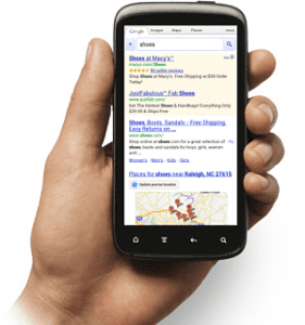
Many of us have only a traditional website designed for desktops and laptops. As Danny Brown urges, redesigning your site so it readily adapts to mobile devices – meaning tablets and smartphones – should be a priority for 2014. Doc Sheldon offers a de-mystifying explanation of responsive/adaptive web design and how to go about it.
But in the meantime? If you’re among the many e-commerce businesses that don’t have the time or resources for an immediate website re-design, there are measures you can take right now to ensure that your site renders better on mobile devices.
Think short, sweet…and scannable.
Break your copy up into short blocks of content – as in one or two sentences – so that it’s as easy on the eye as possible.

In terms of word count per page, slice your copy in half (if not more). Most web pages are anywhere from 250 to 500 words in length. On mobile devices, that word count is liable to equate to a seemingly endless, frustrating scroll of broken content that even the most loyal of customers will likely abandon out of sheer exasperation.
This means being diligent in using sub-headers and bullet points, bolding them so that they highlight the essential information you want to convey and fluidly guide the quick-scan reader through your content. Keep your CTA front and center in your copy, and link it to your sales pages.
(Cautionary note: take it easy on the number of sub-headers, bullet points and links so you don’t overwhelm the reader and sabotage your efforts to keep your site’s content abbreviated for mobile devices.)
Slicing your copy also means being ruthless with your editing, deleting everything but the most important and conversions-compelling information. Save the “mission statement” and any other extraneous, company-oriented copy for your “About Us” page.
Remember, most of your prospective customers don’t care about how green or warm and fuzzy or family-oriented you are – at least, not now. They’re looking to make a purchase. Get out of your own way and let them!
2. Clear CTA
You would think this would be a no-brainer, but it is surprising how many brands “hide” their call to action – even the big boys make this mistake.
For both mobile and desktop platforms, you want your CTA to stand out on your site’s landing pages. And you’ll want to place your CTA on your home and sales pages more than once.
A smart strategy is to cover your bases with a CTA prominently placed at the top of your home and landing pages (which will serve conversions all the more if it’s coupled with a link to your product sales, shipping deals, or other promotions/specials such as free gift-wrapping). Then include your CTA again in the middle, then again at the bottom of your pages to capture the quick-scan reader.
If your potential buyer is frustrated by trying to figure out how to make a purchase, forced to chase down some demure link, s/he is liable to back out of your site and go to a competitor.
So by all means, make it both easy and appealing for your customer to buy!
3. Easy Payment Processing
In the interest of making it easy for your customer to buy, you also will want to make the payment process as simple as possible.
Now is not the time to try to capture a bunch of consumer data, or get him or her to sign up for your fabulous newsletter. A long-form data collection page will turn your potential buyers off. They’re on a mission to buy: now is the time for expediting conversions!
Make your customer’s payment options simple, easy and straightforward. Also, be sure to have your customer service contact information on the same page for ready assistance, should your potential buyer encounter any problems with payment. A toll-free number is ideal; many shoppers haven’t the time or patience for the “chat box”.
4. Free Shipping & Guaranteed Delivery Dates
Of all the compelling perks you can offer your customer, free shipping is paramount. According to a survey from Deloitte free shipping leads as a deal-making factor in e-commerce buy decisions – and by a wide margin (15%) over low prices. As Bulygo put it: “…shipping can be a ‘tipping point’ for your business.”
Putting it more precisely is comScore’s chairman Gian Fulgoni, stating: “Though retailers must often sacrifice margins when they provide free shipping, they benefit because consumers tend to spend significantly more on those transactions.'”
Coupled with the conversions appeal of free shipping is a guaranteed delivery date – if you can guarantee the purchaser’s gift will be there on time for Christmas, and for little or nothing in shipping, you’ll be duly rewarded by those last-minute shoppers!
Some stats about those belated shoppers: According to a Google consumer survey, (U.S.) respondents report that they have an average of 29% of their holiday shopping yet to do a week before Christmas, and a hefty 21.4% to complete as late as December 21st. Those shoppers are your target prospects.
5. Unique product descriptions
As we all know (right?), Google doesn’t like duplicate content – and that includes replicated manufacturer product descriptions. Cookie-cutter product descriptions won’t serve your conversions well, either.
With larger e-commerce sites that list tens of thousands of products, a unique description for each may not be a tenable option. But besides avoiding a Google slap for duplicate content, changing up the manufacturers’ product descriptions as much as possible is a smart strategy for conversions.

For e-commerce sites offering a more limited selection of wares, investing in unique content for your products may still prove time-consuming – but those products boasting a unique description have a far better chance of selling.
You may want to do an internal cost-benefit analysis for how much time/money you should invest into detailing unique per-product descriptions from a diminishing returns perspective, but do keep in mind that a Google penalty is best avoided. And as with free shipping, even if differentiating your product descriptions makes a dent in your bottom line, you should be able to make up the difference with sales volume.
A cost-effective strategy for creating unique product descriptions is to interject sensory metaphors into the manufacturers’ bland copy. Take clothing, for example. Besides the obvious manufacturer specs of sizes, colors, and material, add, well, texturally descriptive words such as “cozy”, “snug”, “smooth”, etc., to add an in-store “touch” dimension to your offerings.
Although a bit more time-consuming, it’s worthwhile to consider search expert Trond Lyngbo’s suggestion of integrating user-generated comments and bringing “…product descriptions to life by telling a story” as another way of adding to product descriptions.
There are other strategies for optimizing your website for holiday sales, such as structured data markup, but these are the five easiest ones that I could think of which you can readily implement today.
Are there any actionable tips you would add? Please share them in the comments below!
Image credit to Recon Cycles via Flickr Creative Commons


