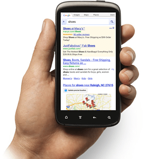
Mobile marketing strategies – or at least marketing strategies that contain a mobile arm – are becoming increasingly more important for business survival. Mobile is changing the landscape of online business and brands have to adapt, evolve and overcome. Carpe diem, business owners!
Mobile Marketing: Not Just Another Desktop Version
I have a pet peeve when it comes to mobile marketing. I do. It’s the seemingly pervasive idea that “mobile” just means “another desktop version.” I don’t want to call out any brands in particular, but when I go to your site on my phone, I don’t want to move the page from side to side to see all the content. It makes for a very bad user experience, which is what I want to spend this section talking about.
Mobile User Experience
You’d be amazed at how much you can get under Google’s radar with when it comes to mobile. Just because Google’s Mobile Friendly test gave you a 10/10 doesn’t mean your mobile site provides a good user experience.
For example, I like to have a little padding on my paragraphs so the words don’t butt up right against the screen sides. Google doesn’t pay attention to that. So even when the words are so tight that I can’t tell if that’s an “L” or an underscore, Google says it’s mobile friendly.
Mobile Marketing Strategy #1: User Experience Testing
If your website isn’t performing in mobile search, or you see that your bounce traffic on mobile is much higher than desktop, it’s time to dive into user experience testing as a marketing strategy.
Listen, the mobile user experience is about mobile. If you rely solely on programs to tell you how mobile friendly your website is, you’ve failed as a marketer. Don’t get so caught on programs that you forget your brain is the best processor out there.
With this in mind, the very first thing is to go look at it yourself. There is no replacement for your own eye. Before you go to user testing companies, look at the site on your own mobile devices. This alone can save you time and money (user testing can get expensive).
A few tips:
- Test on multiple platforms. What looks good on Android doesn’t necessarily look good on the iPhone or Windows phone.
- Test on multiple devices. Tablets, laptops, mobile phones – all of these devices display differently. Remember: adapt, adapt, adapt.
- Test different pages. Just because your home page looks good doesn’t mean your product pages do. The same for blog pages. Look at each type of page you provide on your site.

Mobile Search Marketing: Voice Search and Instant Answers
Marketing for mobile search engines changes the game some, because we’ve stepped into the realm of science fiction. We now talk to our phones and tablets and expect answers back. We say, “Okay, Google,” or “Alexis, please…” We consult our devices for answers to questions like, “When is sunset?” and “What was the final score?” Computers, television, cars, we’re interconnected in a way not possible even 20 years ago.
The way we interact with our devices has changed the way we think and search. In turn, it changes the way search engines display results.
Instant answers are a good example of this. Search for “slander vs libel” and you get an answer box (aka Featured Snippet). Yes, the answer comes from a website. And yes, it’d be really cool if your site could be the site to have the top answer. But only one site can have the top answer, which means the competition is astronomical.
Mobile Marketing Strategy #2: Restructuring Content
Someone searching by voice is usually looking for a quick answer, like in the questions above. However, you can combat that by providing cleaner, more structured content. Headings, bullet points, short paragraphs and short sentences provide content that is easier to read on a mobile device.
A/B testing is often ignored, but is a very powerful tool. If you have pages that aren’t performing well in the mobile arena – especially if they’re doing better in the desktop version, it’s time to start testing page elements.
Testing ideas to consider:
- Streamline mobile contact forms to ask for as little information as possible. You can always request more information after the sale.
- Focus on top selling products at the top of the page, with an option to view more. This keeps them from having to scroll down a huge page.
- Keep distractions down to a minimum. The product page is not the place to offer a subscription to your newsletter or blog.
- Keep navigation items short. Instead of all your pages listed, break them into sections. “Men,” “Women,” and “Kids,” for example. I have seen a navigation so long I couldn’t see the end of it on my phone.
- Test different layouts. If you have over 25% mobile traffic, having a mobile friendly layout (rather than just having a responsive site) is a strong consideration. Reducing content and clutter on mobile sites is a high priority.
Mobile Marketing Performance: Reduce Ineffective Marketing Clutter
As many long-term marketers know, marketing “clutter” can seriously screw up a campaign. Marketing clutter can be thought patterns, “we’ve always done it this way.” It can be the use of methods that are no longer viable. The most pervasive marketing clutter, however, is from processes that were put in place a long time ago and never revisited. In these cases, you hear a question like, “Why are we doing this,” which is followed by a shrug and, “I dunno. That’s just the way I was shown to do it.”
Example:
A husband asks his wife why she always cut the tips off the holiday ham before cooking it. She says, “I don’t know. My mother did it, so I do it.”
She calls up her mother. “Mom, why do you cut the tips off the holiday ham?”
“I don’t know. That’s what your grandmother taught me.”
Mom calls up grandmother and asks her the same question. “Oh,” she says. “Well, back in the day I didn’t have roasting pan big enough, so I had to cut the ends off the ham for it to fit in the pan.”
What’s the moral? Always check the “whys.” What was once necessary may no longer be needed.

Mobile Marketing Strategy #3: Monitoring Processes and Performance
Monitoring campaign performance should already be on your to-do list. However, mobile traffic adds a new dimension.
Why? Because your site is not ranking on the same page for “radiators” in mobile as it is on desktop search. Because your page will not perform as well on one version as it does on the other. Because mobile and desktop are different, and the users treat your site differently. That’s why.
Also, monitor processes to keep them streamlined. Don’t settle for “we’ve always done it this way.” The more manpower you spend on non-essential, ineffective works, the less you can spend on activities that really work!
Potential signals to watch for:
- Am I monitoring mobile conversions in Google Analytics? (separate conversion recording is easy with Google Tag Manager)
- Which products perform better on mobile?
- How many mobile visitors drop out of the sales funnel?
- How does that number compare to the desktop versions?
- How many mobile visitors never leave the landing page?
Final Thoughts
The way we market our businesses online is changing and diversifying rapidly. As I said at the beginning, we have to evolve with them to survive.
The three strategies above are just a way gate – a starting point – on your journey to better sales. As you take in the information from each one, you have to do something with it. -And as you do, your site will become a more conversion-friendly place for your customers to go.
At the end of the day, you have a product or service that people need. It behooves you, then, to make it as easy to find and purchase as possible. From whatever road they take, and whatever device they take it on.
If you need help with your mobile marketing strategies, call us. We specialize in making sites purchase friendly.
Want more mobile marketing tips? See Optimizing Your Website for Mobile Traffic


