
In case you haven’t heard, mobile is the word for the year. Smartphones and tablets are nothing new. But, mobile traffic and usage are expected to increase by seven times their current rate within the next two years.
Not only have rates of usage increased, opening up new markets in some of the most remote regions of the world, the ways we use our mobile devices is also evolving. They’ve reshaped business culture, communications, and how we shop. Many financial transactions begin and end on a mobile device. As of last July, even Google has altered their algorithms to index for mobile content first.
If you want to remain competitive and reach your audience, you have to rethink how you design and market your website, and optimize your web presence for faster mobile traffic
The Impact of Mobile Computing
As of February, 2019, mobile devices accounted for more than half of all global internet traffic. By 2022, it’s expected that there will be more than 77.5 exabytes of mobile data transmitted per month.
Put into perspective, that’s the equivalent of one billion gigabytes of information flowing through our cell phones and tablets. Think of it as multiplying the content of an average 250G hard drive several hundred thousand times.
Pretty mind-boggling, isn’t it?
Whether you’re a website owner or internet marketing specialist, your goal is to capture a fraction of that mobile traffic and make it work for you. You need to flip the script and put mobile first.
5 Quick Steps to Mobile Optimization
Mobile first simply means designing a website so that it’s as functional and visually pleasing on a smaller screen as it is on a PC monitor. You want to assume that all content and traffic will originate from a mobile device and plan accordingly. Any web designer worth their fees is already optimizing new websites for responsiveness.
How mobile-friendly is your website? You can test it here or you can try this one, built by Experte out of Germany.
If you haven’t already re-tooled your current website to prioritize mobile access, here’s a quick guide that’s designed to get you up to speed fast.
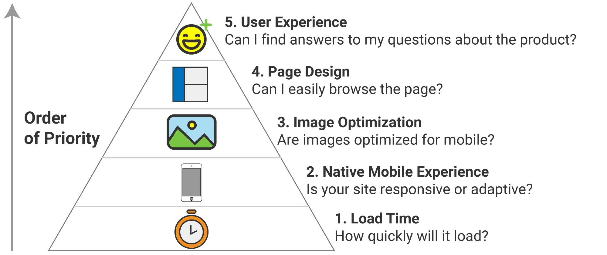
Improve Page Load Times
The main issue with many web pages on mobile devices vs desktops is how fast the pages load. Users don’t have a whole lot of patience when it comes to accessing content. On average, you have 10 seconds or less before a visitor will move on. The typical mobile web page takes up to four times longer to load than that same page on a PC, which takes an average of four seconds to load with everything optimized.
In order to improve page speeds:
* Use a content delivery network (CDN). This will bring your content closer to the visitor.
* Enable caching. This will reduce the number of requests from users by storing content on the local device rather than your server.
* Minify CSS and JS code by eliminating redundancies, unnecessary comments, and white space.
* Keep everything updated by using the most recent versions of CMS software and deleting any unused or unsupported plugins and themes.
You can test page load speeds with this tool; many web hosts also include speed tests with premium plans.
Provide a Mobile Native Experience
Mobile native means that the content should be designed with the assumption that it will be viewed on a mobile device. Here, you’re going for responsive design, which means that the content layout shifts intuitively according to screen size, rather than adaptive design, which entails completely changing the layout for each platform.
Optimize Images for Mobile Viewing
Images are one of the biggest resource hogs and reason for slow page loads. They also add value to the user experience. You can have your images and maintain a decent site speed by optimizing images for mobile viewing.
There are several ways to do this. You can create a collage of images rather than loading a gallery of separate pics, compress the image files, change the file type, or become more selective about the number of images you use. Do you really need 10 pics or one great one?
If you’re not good at resizing, this tool will help.
Design Pages for Mobile Viewing
This means looking at your content with a critical eye from the vantage point of the user and adjusting how the page is laid out. Consider what you want your visitors to do, and design your page to make it easier for them to do it. You should put all of the important info above the fold, which is the top third of the page. Important functions like call to action buttons should be up-front and center rather than at the bottom of the page.
Consider User Experience (UX)
All of the above suggestions and best practices all lead to one thing: user experience. Not only does providing an above-average UX help you convert traffic to customers, it also elevates your place in the search engine page ranks (SERPs).
- User experience is assured when your website:
- loads quickly and completely
- has a design aesthetic that’s pleasing and easy to navigate
- makes users want to return often and spend more time on your pages with each visit
Think shorter, more actionable content, efficient contact forms, and value. In short, keep it simple and effective.
Final Thoughts
It’s never too late to make sure your website is ready to handle traffic wherever it originates. Over the next few years, mobile traffic and computing is set to outpace PCs by a wide margin as the platform of choice for shopping and accessing web content.
Our tips won’t guarantee you’ll get more mobile traffic. That’s a topic for another time.
However, making sure that your content is functional and appealing from any platform will go a long way toward providing the kind of user experience that makes Google and audiences happy.
This post has been updated on March 6th 2023, to include The EXPERTE.com Bulk Mobile Friendly Test. This enables you to assess the mobile optimization of all your website’s (sub) pages, not just the homepage. Up to 500 subpages can be evaluated at once as it crawls through your entire website.


2 Responses
Great post! Thanks for sharing the best tips to optimize a website for mobile traffic. These will help to improve the user experience for my website.
Nice article to optimize the website for mobile traffic.