
There’s a familiar kind of frustration that shows up when marketing reports don’t behave the way we think they should. One platform shows growth, another shows decline. One dashboard says the campaign worked, another makes it look like the whole thing wandered off into the woods and forgot why it was there.
So, naturally, the first instinct is to fix the tool.
Maybe the tracking is wrong. Maybe the dashboard is missing something. Maybe the connector broke. Maybe we need another report, another platform, another export, another spreadsheet tab with a name like “Final_Final_UseThisOne_v3.”
Sometimes, yes, the setup really is broken. Tracking can be missing, and events can fire twice. Multiple data sources can be configured too narrowly to support the conclusion someone is trying to draw. But a lot of the time, the deeper issue is that you’re looking at one layer and expecting it to explain the whole system.
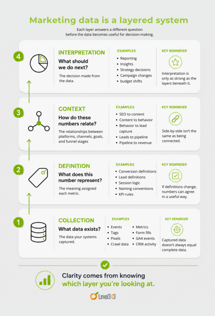
Marketing data doesn’t exist in one place. It exists in layers. Collection, definition, context, and interpretation all shape what the numbers mean before anyone ever makes a decision from them.
It’s common to wonder what to trust when the numbers don’t match. To understand what your data is telling you, you have to understand which layer you’re looking at.
Data isn’t a flat system
It’s tempting to think of marketing data as if it sits in one clean place, waiting to be pulled into a report. That would be lovely. It would also make reporting meetings much shorter, which is reason enough to wish for it.
In practice, data behaves more like a stack than a flat plane.
Building a data system the right way takes understanding the layers and their placement in the system. At the bottom, you have what gets collected. Above that, you have the definitions that determine what those numbers mean. Then you have the relationships between analytics platforms, marketing channels, content systems, and funnel stages. Finally, you have the interpretation layer, where someone decides what happened and what to do next.
Each layer answers a different kind of question.
- Collection asks, “What data exists?”
- Definition asks, “What does this number represent?”
- Context asks, “How do these numbers relate to each other?”
- Interpretation asks, “What should we do next?”
When those layers mesh, the data becomes easier to use. It may still be imperfect, but at least everyone has a clearer sense of what they’re looking at. When the layers don’t align, however, even valid numbers can feel contradictory.
That’s where a lot of marketing reporting gets messy. The data isn’t necessarily wrong. The report may even be technically accurate. But if the layers underneath it were never made clear, the numbers can still lead you in the wrong direction.
That’s an important distinction, because each layer can break in a different way.
The collection layer shows what’s captured, not what’s complete
Collection is the first layer because it controls what enters the system in the first place. This is where your raw inputs live: the layer that tells you what your systems captured. It includes data points such as:
- events
- tags
- pixels
- crawl data
- platform metrics
- form submissions
- micro conversions
- Search Console data
- GA4 events
- ad platform conversions
- CRM activity
- third-party visibility data
That matters, but captured data is not the same thing as complete data.
You can only report on what the system is set up to see. If the same event fires twice, the numbers may look better than reality. If a tool is only watching a small slice of the site, the data may make performance look weaker than it actually is.
If people block tracking, reject cookies, or don’t grant consent, the activity doesn’t disappear from reality. It disappears from your reporting. That’s unobserved search data, and it’s one more reason collection shows what was captured, not what was complete.
Partial measurement can cause bad conclusions
We’ve seen this during audits. A client may believe a site has no meaningful organic visibility because the third-party tool they’re checking shows almost nothing. Then we look closer and find that the setup is only tracking one page, a small keyword group, or a narrow slice of the site. The tool isn’t wrong; it’s just not showing enough of the picture to support the conclusion being made.
Collection tells you what you’re seeing. It doesn’t automatically tell you whether you’re seeing everything you need. If collection is incomplete, the report built on top of it will be incomplete, too. So, you need to understand the limits of the data layer you’re looking at before you treat the numbers like the whole truth.
Where collection can go wrong
Collection issues usually show up as missing, low, or suspiciously narrow numbers. Form submissions can report lower than expected because the thank-you page event isn’t firing. Organic performance can look weaker than it is because only a portion of the site is being tracked in a third-party tool.
If the same action is counted more than once, paid conversions can be inflated. A crawl report can miss important sections because the crawler settings were too limited, or the tool only crawls a specific number of pages at a time.
Before you interpret the data, ask whether the system captured enough of the right activity to answer the question. That question alone can save you from making a strategy call based on a peephole view of the business.
The definition layer determines what your data actually means
Once data is collected, the next layer is definition.
A lot of reporting confusion starts here because familiar words lead people to assume familiar meanings. Traffic. Lead. Conversion. Contact. Session. Revenue. Attribution. Engagement. They sound straightforward until you realize every data source may define them differently.
In Google Analytics 4, a key event is one you mark as especially important to the success of your business. This could be a form submission, a call click, a download, or another action you decide matters.
In HubSpot, marketing attribution reports can connect interactions to contacts, deals, and revenue. Those measurements are related, but not the same thing.
These differences aren’t just minor wording issues. They change what the numbers can responsibly be used to say. A form submission isn’t automatically a new contact. A contact isn’t automatically a qualified lead. A qualified lead isn’t automatically an opportunity. And an opportunity isn’t automatically revenue.
I can hear you saying, “We all know this,” but we only “know this” when we slow down and say it out loud. Reporting has a funny way of flattening those distinctions.
This is how marketing teams end up comparing unlike numbers as if they should match. If one person says “leads” and means form fills, another means new CRM contacts, and a third means sales-qualified opportunities, the data conversation is already sideways before the first chart appears. Not only is this like comparing apples to oranges, but sometimes you’re in a whole other orchard.
Where definition can go wrong
As we discussed in our last data governance article, “If More Data Doesn’t Create Better Marketing Insight, What Does?“, numbers may not agree because the definitions never matched.
That article goes deeper into how similar-sounding measurements can mean very different things, so we don’t need to walk through every discrepancy again here. The point for this layer is simpler: the definition layer is where meaning gets assigned. If meaning shifts from one platform, team, or report to another, the rest of the data stack gets shaky.
At this point, governance becomes less about cleaner reporting and more about shared language. Before anyone compares numbers, you need to know whether those numbers are speaking the same language in the first place.
Write the definition down. Decide what “conversion” means in each platform. Decide which system owns which definition. Decide when a metric is useful as an optimization signal and when it is strong enough to support a business decision.
And remember: if the definitions don’t match, it doesn’t matter if the numbers do.
The context layer connects your data into something usable
The collection layer tells you what was captured. The definition layer tells you what the numbers mean. The context layer tells you how the pieces relate to each other. This layer connects:
- SEO data to content performance
- content performance to on-site behavior
- on-site behavior to lead capture
- lead capture to qualification
- qualification to pipeline or revenue
Without context, your data stays trapped in platform-shaped boxes on your marketing dashboard. Box 1: Search Console says impressions are up. Box 2: GA4’s user behavior metrics say engagement is down. Box 3: HubSpot says contacts are flat. Each source may be telling the truth from its own position, but none of them explains the whole movement.
Context matters
I want to spend a little time here because context is very important. It’s the lens we use to start making data-driven decisions.
You may have stronger visibility for informational queries, but fewer form fills. On the one hand, this can look like your campaign is failing. It’s easy to trash an entire marketing campaign based on numbers like that.
But what’s the context? Those visitors may not be ready to convert. Maybe you’re getting fewer form fills, but the lead quality is better.
Another example: You have high social engagement and the content is performing well, if you look at likes, comments, and so on. Wonderful! Let’s repeat whatever we did last time!
But… what’s the context? What’s the goal? If the goal is to increase social engagement, well done. If the goal is to drive conversions or meaningful site behavior, and no one ever leaves social to go to your site, is your high social engagement really doing what you want it to do?
Bottom line: the context layer helps you see the relationship between the numbers, the platforms, and the goal.
Where context can go wrong
Context problems usually show up when numbers don’t connect. SEO reports live in one place. Content reports live somewhere else. Social engagement gets reviewed separately. CRM outcomes are discussed later, often by a different team. Then everyone gathers around the conference table and wonders why the story feels fragmented.
Well. Because it is fragmented.
When SEO data is isolated from conversion data, you can see rankings and clicks and not know whether the content supports meaningful action. Social data can show you social engagement, but if it’s disconnected from site behavior, you won’t know whether it’s moving anyone closer to the sale. Measuring content performance without understanding intent can mean mistaking awareness-stage success for bottom-funnel failure.
This is one reason dashboards can be both helpful and misleading. A dashboard can put numbers in the same visual space, but that doesn’t mean the relationship between those numbers is clear. Side-by-side is not the same as connected.
The interpretation layer is where decisions are made, good or bad
Interpretation is the top layer. This is where someone looks at the data and decides what happened. This is also where partial data can do the most damage.
You think you’re making informed decisions, but if the collection layer is incomplete, definitions are inconsistent, and context is missing, interpretation becomes more vulnerable to error. This isn’t because the person reading the report is careless or uneducated, but because the layers underneath the conclusion can’t support the weight being placed on them.
In cases like this, we tend to react to surface-level metrics. Traffic is down, so we assume content is failing. Conversion rates are up, so it must mean lead quality improved. Engagement is high, so the campaign worked. Revenue is lagging, so marketing efforts underperformed.
Any one of those statements could be true. Any one of them could also be wrong, incomplete, or missing the bigger picture. The interpretation layer is only as strong as the layers beneath it.
Where interpretation goes wrong
Interpretation issues usually show up as uncertain decisions. The numbers are there, but nobody feels confident. The dashboard is full, but the next step is still fuzzy. You can point to movement, but you can’t explain whether it’s important.
That’s usually a sign that the interpretation layer is being asked to compensate for weak structure below it. It’s why “Which number is right?” is often the wrong first question.
A better question is: Which layer is this number coming from? Followed by:
Is this a collection issue? A definition issue? A context issue? Or are we interpreting one valid data point as if it explains more than it actually does?
That shift changes the conversation. Instead of arguing over whose number wins, you start identifying where the system needs more clarity.
Why marketing data can feel contradictory when the layers aren’t aligned
When the layers aren’t in line, it can feel like the data is arguing with itself. Often, tools disagree because they’re operating on different layers. It’s not always because they’re wrong. The real truth is this:
- If collection is incomplete, you’re working with a partial view.
- If definitions are inconsistent, similar words may point to different realities.
- If context is missing, related metrics look disconnected.
- If interpretation jumps too quickly, the decision may be based on the easiest number to see rather than the strongest evidence available.
A platform built to measure search visibility will not behave like a platform built to measure on-site behavior. A tool focused on campaign optimization will not behave like a CRM that records pipeline and revenue. A reporting dashboard does not erase those differences just because it places the numbers beside each other.
I’ll take it one step further. The disagreement in data flows isn’t always the problem. The problem is not knowing what the disagreement means.
This is the same pattern you’ve already seen in content
If you’ve followed our recent work on topical authority, this pattern should sound familiar.
Content doesn’t build authority just because it exists. A site can have hundreds of pages and still struggle to communicate depth if those pages are disconnected, redundant, thin, or poorly structured. Pages need relationships. They need internal support. They need a clear role in the larger system.
Data works the same way.
Metrics don’t create understanding just because they exist. A business can have dashboards, exports, CRM reports, attribution models, crawl data, and campaign reports, and still struggle to make confident decisions if those numbers aren’t structured.
Disconnected pages dilute authority. Disconnected data dilutes insight. In both cases, the answer isn’t more stuff. It’s better structure.
A simple way to see which layer is breaking
You don’t need a full enterprise data governance program to start diagnosing where the issue is. Start by listening to the type of confusion you’re hearing. Look at:
- The collection layer: if numbers are missing, surprisingly low, duplicated, or too narrow
- The definitions layer: if numbers don’t match across platforms
- The context layer: if numbers exist but don’t explain each other
- The interpretation layer: if the team has reports but still can’t decide what to do next
It’s not a full audit, but it gives you a starting point. More importantly, it keeps you from treating every reporting problem like the same reporting problem. Not every issue needs a new dashboard.
Sometimes you need to fix tracking. Sometimes you need to define terms. Sometimes you need to connect sources. And frankly, sometimes you need to just stop asking one metric to answer five questions it was never meant to answer.
What this changes about how you approach your data
Once you start thinking in layers, the reporting conversation changes.
You stop asking, “Which number is right?” as if every platform is supposed to produce the same answer.
You start asking:
- “What layer is this number coming from?”
- “What question was this source built to answer?”
- “What definition is being used?”
- “What context is missing?”
- “What decision are we trying to make from this?”
That shift moves you from reaction to understanding. Instead of chasing discrepancies every time two tools disagree, you can decide whether the disagreement is expected, useful, or a sign that something needs to be fixed. That’s a much stronger way to use marketing data.
Where to go next
Once you understand the layers, the next question becomes easier to answer. Why do tools still tell different stories?
Because SEO, social, analytics, ad platforms, and CRM systems are not just separate tools, they’re often separate narratives. Each one sees a different part of the journey, applies its own logic, and reports from its own position.
The work is not to force every tool into one perfect story. The work is to understand how those stories fit together, where they conflict, and which one should guide the decision in front of you.
Bottom line: Clarity doesn’t come from more data. It comes from understanding how your data is structured.
When your data tells different stories, you don’t need another dashboard. You need a clearer system.
Level343 helps you identify where collection, definitions, context, and interpretation are breaking down so your team can make better decisions with more confidence.