Mobile advertising is huge these day, and rightly so. In 2008, mobile digital media usage was only 12% of the total. Seven years later, it’s become a whopping 51% of all digital media usage. That’s a quite a leap and marketers realize it – which explains the overwhelming plethora of ads targeting mobile devices, and the reason for this article on mobile ad design.
Listen: as an online marketer and business owner, I understand how badly you might want to get your call to action (CTA) in front of your visitors. After all, the action is why you wanted them to visit in the first place, so if they don’t see it, the time is wasted, right?
Well, not exactly, but it does feel like that some times.
However, the time really is wasted if you get the CTA in front of your visitors and it turns them off of your site completely. This happens more often than you might think, and it’s a shame. I can’t count how many sites I’ve come across that were built for mobile with ads that weren’t.
But first, let’s talk about why this topic about mobile ad design is going to be important for you.
When Google Doesn’t Like Your Mobile Ad Design
You may have heard this. After all, it’s absolutely big news in the world of online marketing. The Next Web wrote about it, as did HubSpot and Mashable, among some of the notables. The official Google blog says this:
Pages that show intrusive interstitials provide a poorer experience to users than other pages where content is immediately accessible. This can be problematic on mobile devices where screens are often smaller. To improve the mobile search experience, after January 10, 2017, pages where content is not easily accessible to a user on the transition from the mobile search results may not rank as highly. (emphasis ours)
So what is an interstitial? In short, we’re talking about a page that shows before or after the visitor is able to view the actual website content i.e. the popup. What the above means is that, if your popups cover your mobile website, your ranking could very well be demoted for the mobile version.
Tread carefully now. Good mobile ad design is going to be more important than ever. “User friendly,” people. Learn it!
When Visitors Don’t Like Your Mobile Ad Design
We talk a lot about user experience, and read even more. For example, the Nielsen Norman Group has an excellent section on web usability, as well as mobile and tablet design. If you read usability blogs often, you find out something that may or may not surprise you.
We humans are a fickle lot. We want results, we want them now, and we want them to be easy. We want a website to load at the blink of an eye, immediately provide us with the information – oh, and that information needs to be concise, without a lot of flattery.
Phew! We expect a lot!
With that in mind, what happens when something we don’t want, such as an ad we weren’t asking for, gets in the way of all that? It can often throw off the information trail. -And I can tell you, it doesn’t take too many distractions to have them going to someone else’s site with a cleaner experience.
Current Mobile Ad Design: Like Throwing Spaghetti
I came across this article in Digiday that – even though it’s an older post – perfectly describes the issue. I particularly liked what the CEO of Charming Robot had to say:
“Publishers are doing what they always do, which is look at their competitors and copying what they see other people doing without knowing what’s effective,” said Dan Maccarone, CEO of design firm Charming Robot. “At the same time, they are also really trying to figure this stuff out. A lot of these publishers are experimenting with things right now and seeing what sticks — like throwing spaghetti at the wall, really.”
From a marketer’s perspective, for example, it might seem like a good idea to have an ad pop up that takes over the screen – and when you’re talking about desktop sites, this isn’t so bad of a deal. You might get something like this:

Oh, sure, it takes over the page, but you can click on that black “x” to close out, or even click on the page itself. It’s barely a blip on the screen, and you’re back to your regularly scheduled programing.
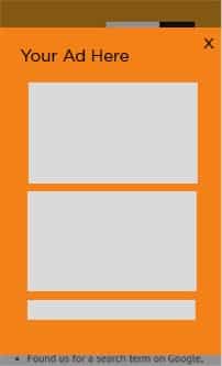
What often happens, however, is that the pop up transfers to the mobile site as well, and you get this:

Now, I can tell you from experience, that little “x” doesn’t do a very good job on mobile. – And tapping on the rest of the screen to make it disappear? Forget it. Most areas are too small to reach with a finger or thumb.
The odd thing is, this kind of error seems to happen even if the rest of the site has been “mobilized.” It’s almost as if the publisher decided that the rest of the site was mobile friendly, so the ads would automatically be, as well.
I visit a lot of sites for the first time on my mobile phone. If I come to your site and see the above, I go someplace else. Why? Because those ads are impossible to get by. So, while you’ve put the ad in front of me, you’ve lost a potential buyer.
Quality Mobile Ad Design
As with anything that has to do with design, quality mobile ad design has to do with user experience. As a reminder, this is what Google is complaining about, and what they’re targeting. Basically, if an ad keeps you from viewing the rest of the content, it’s a poor user experience.
So, what’s a marketer/ business owner to do?
Rethink ad design and placement. Rethink your mobile design. Start thinking of mobile as a distinctive, valuable player in the field of conversions. Many of your competitors have already made this shift in thinking.
Recent Examples
Recently, we revamped a client’s WordPress website using a theme that allows individual page building. This particular theme gives options for elements to be shown on desktop, tablet, mobile, or any mix thereof.
For her CTAs, we provided one version on the desktop and a one version on the mobile. Although the page content was the same, the CTA placement and requested information differed per platform. On the desktop version, email and name were requested. On the mobile version, the CTA was a click-to-call phone number in a small box at the top and bottom of the page.
On another site, we have a “subscribe” popup for desktop and mobile. However, the mobile version is considerably smaller and made for big thumbs. It’s also at the bottom of the page, rather than the middle, and there’s no overlay. This way, the visitor can continue to scroll and read, even if the subscribe CTA is visible.

Two Plugins to Make WordPress Mobile Ad Design Easy
For WordPress sites, there are numerous plugins that can help with this. The two I’d really like to pinpoint, because we’ve used them, they work, and they’re good at what they do, are OptinMonster and Icegram.
OptinMonster ranges from $9 to $29 per month. At the highest level, you can build mobile-specific ads. If you follow the link (no affiliation), you’ll be taken to the pricing chart comparison to see what each level gets you. It’s a pretty comprehensive plugin.
Icegram is free. Now, it’s hard to look at “free” as something of value. After all, if it’s free, even the creators don’t give it value, right? Well, we like free because free means we get to keep our costs down. However, it doesn’t mean we’re willing to sacrifice quality.
Icegram is an excellent popup plugin the gives OptinMonster a run for its money in many instances. Clicking the link (also no affiliation) will take you to the features page, to see what the program gets you. Again, it’s a comprehensive plugin.
Final Thoughts
Mobile ad design is as important as any kind of design. Placement matters, but user friendliness matters more. User experience makes all the difference between a sale and a fail. Don’t sacrifice your sales for more ad real estate!


2 Responses
Hi Gabriella.
Good points! Google places a huge premium on having a blog that’s easy to read on mobile. Because all folks seem to be on mobile these days 😉 As for intrusive ads these are dying like the dinosaurs. For good reason too. Who likes to be interrupted? If we love content, we will SEEK OUT the sign up form. No need to bop us over the head with ads, opt in pop ups or anything that delays the content we showed up to read 😉 Thanks for sharing!
Ryan you had me giggling with the bop us over the head remark!! ? Appreciate your input!